Content Designer. Technical Writer. UX Writer.
As it is written, so it shall be done.
Content design and technical writing shaped by time at AWS, structured-authoring systems, and a habit of treating every project (professional or personal) like a system worth documenting properly.
Looking for content design or UX writing work specifically? Use the filter in the sidebar — it's more complete than a static list.
content designer / technical writer
> stack
DITA · Zonbook · technical writing · conversation design · UX writing
> status
open to new roles
AWS work, in spec-card form.
Click a card to flip it: the front reads like a doc summary, the back reads like the stat sheet behind it. Full write-ups for the deeper cases sit below the grid.
Building the first customer-facing docs and console copy from zero.
Sole content designer on AWS User Notifications from launch, covering UX copy, documentation architecture, and a cross-service writing template end to end.
Cutting the friction out of app creation.
Content and flow work on myApplications aimed at making the weekly app-creation habit faster and less confusing to stick with.
Writing at scale for an agentic AI workflow.
Production-ready strings written for Amazon Q CLI-driven Action Recommendations: copy that has to hold up across dozens of automated contexts.
AWS documentation, kept in one system.
Ongoing structured-authoring practice across AWS documentation using DITA and Zonbook, from single-sourcing to reuse strategy.
Naming a permissions model that didn't exist yet.
Introduced Channel Roles, User Roles, and Guardrails when Q's chat commands went from read-only to mutative, without breaking the mental model existing users already had.
Writing the small moments: empty states and modals, on the go.
Content for the AWS Console Mobile Application, covering empty states and modal interactions across the on-the-go experience.
Full case study: AWS User Notifications
+Overview. AWS User Notifications centralizes alerts across accounts, regions, and channels. I was the sole content designer on it from launch, owning content strategy end to end: UX copy, documentation architecture, a cross-service writing template, and post-launch iteration.
The problem. Before this service existed, getting notifications meant manually configuring EventBridge rules, CloudWatch Alarms, and SNS topics: fragmented, inconsistent, and easy to get wrong. Alerts arrived in disconnected formats, there was no unified view of account health, and raw SNS emails offered little context. The goal was to consolidate all of that into one experience people could understand and adopt quickly.
Process. Pre-launch, I worked with PMs, engineers, and a UX designer to shape the content strategy alongside the service architecture, iterating on console copy, error messages, and notification templates before anything shipped. For launch, I authored the full user guide and getting-started content, and built a cross-service documentation template so any AWS writer could document their own service's integration consistently. Post-launch, I deployed docs alongside engineering from GitHub, tracked feedback and performance, and later added API and CloudFormation guides for more integration paths.
Key decision: managed vs. user-configured notifications. When AWS introduced notifications delivered automatically by default ("managed"), the existing guide only covered the kind users set up themselves. I restructured the guide into two clearly named sections, managed and user-configured, within the same document, so the distinction was immediately clear regardless of which type a reader arrived looking for. The naming was deliberate: parallel terms that tell users exactly who controls what.
The cross-service template. Since User Notifications integrates with nearly every AWS service, dozens of other writers needed to document their own service's integration. I built a standardized template with required sections and customizable fields, which kept documentation consistent across AWS, saved other writers significant time, and cut down my own review overhead.
Outcome. A complete documentation set (user guides, UI text, conceptual content) built from zero and ready at launch, on a framework designed to scale as new notification types and channels were added without a rewrite.

The AWS User Notifications console.
Full case study: Amazon Q in Chat Applications
+Overview. Amazon Q in chat applications (formerly AWS Chatbot) is a generative-AI assistant built into Slack and Microsoft Teams for monitoring, troubleshooting, and running commands against AWS resources. When it expanded from read-only commands to mutative ones (actions that could change or delete resources), the product needed a permissions model it never had before. I was the content designer responsible for introducing that new conceptual layer without breaking the mental model existing users already had.
The problem. This wasn't just writing about new features. It meant naming concepts with no prior reference in this product's vocabulary, building a mental model two different audiences (administrators and end users) could each enter from their own side, and doing it without contradicting documentation people already understood.
Naming the concepts. I introduced three terms: Channel Roles, User Roles, and Guardrails. The first two mapped cleanly onto existing enterprise-software conventions. Guardrails was the harder call: I found precedent in AWS Control Tower's use of "guardrails" for policy-based account controls, which gave the term a documented basis in the AWS ecosystem and made a stronger case to stakeholders than inventing new vocabulary. Consistency with the platform's existing language is what lets users transfer what they already know.
The information architecture problem. Channel roles and guardrail policies both apply at once, and guardrails always take precedence regardless of role. The line that made this legible to administrators: "What your users can do is the intersection of your guardrail policies and what is allowed by their roles." That sentence became the mental model the rest of the page reinforced rather than introduced.
Two audiences, one system. Administrators configure the channel: permission scheme, channel roles, guardrail policies. End users operate inside whatever the administrator set up, and set their own roles if the scheme requires it. I structured the docs so each audience could find their own path without reading content meant for the other, while making sure neither missed context that affected them.
Validation. I validated both the content and the naming with engineering and product stakeholders before publishing, checking the Guardrails terminology specifically against the Control Tower precedent for ecosystem consistency.
Outcome. Channel Roles, User Roles, and Guardrails are live in the product and its documentation today, and the permissions documentation became the conceptual foundation for how administrators understand and configure Q's security model.
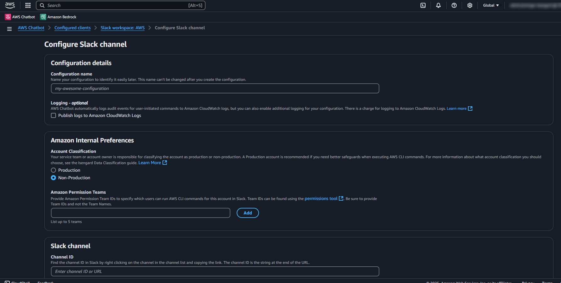
Slack channel configuration page — UX copy across the configuration flow: field labels, helper text, and inline guidance. Each field description anticipates the question an administrator would ask before filling it in.
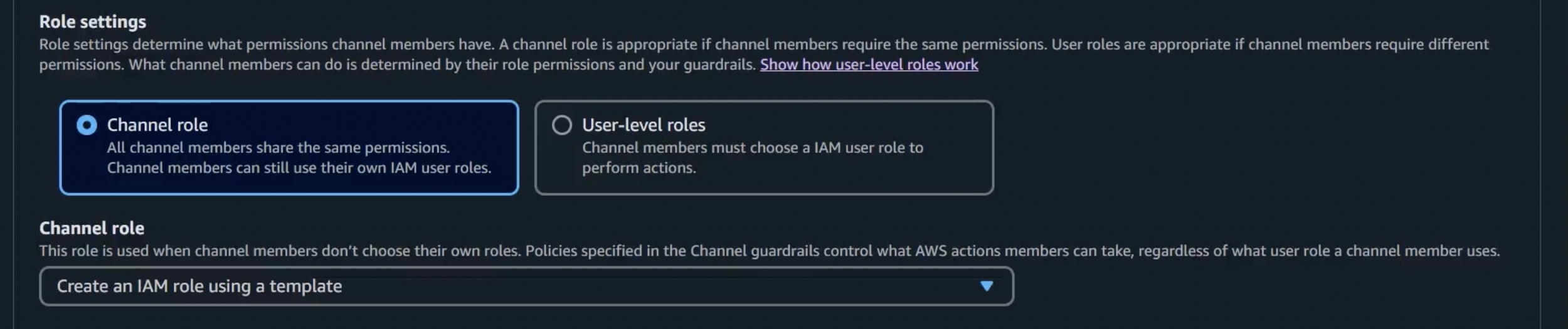
Role settings panel — the intro copy establishes when each option is appropriate before asking administrators to choose, reducing the cognitive load of a decision that affects every channel member’s permissions.
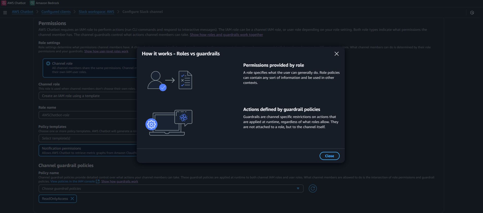
How it works modal: Roles vs. guardrails — a contextual modal viewable from the configuration page, designed to surface the key mental model distinction without interrupting the setup flow. The parallel structure makes clear that roles define what a user can generally do, while guardrails restrict what they can actually do in this channel, regardless of role. Getting this distinction wrong in either direction would cause administrators to misconfigure permissions.
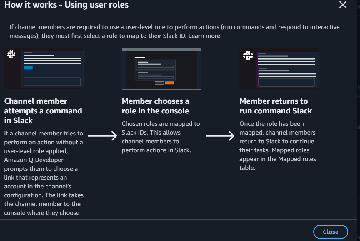
How it works modal: Using user roles — a contextual flow diagram viewable when channel members encounter the user-level roles requirement. The three-step structure maps the cross-surface journey (chat application to console and back), so users understand what’s about to happen before they’re interrupted by it. A user who hits a permissions wall without context is likely to abandon the task or contact support; the modal surfaces the right explanation at exactly the right friction point.
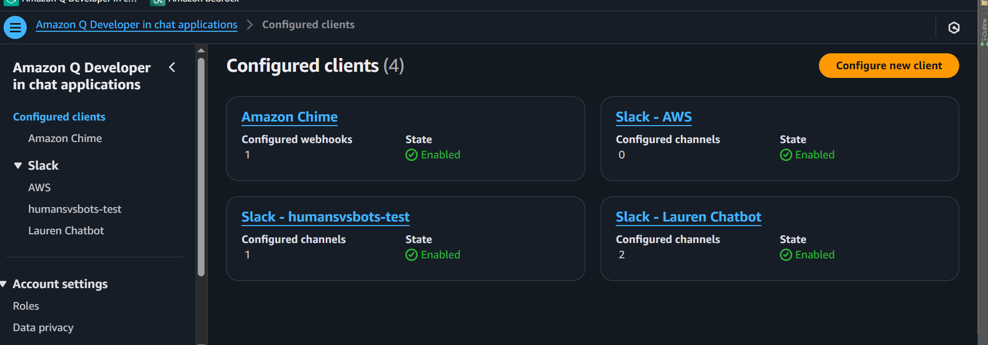
Q in chat apps console.
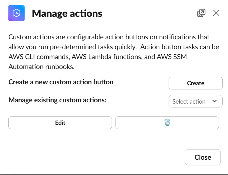
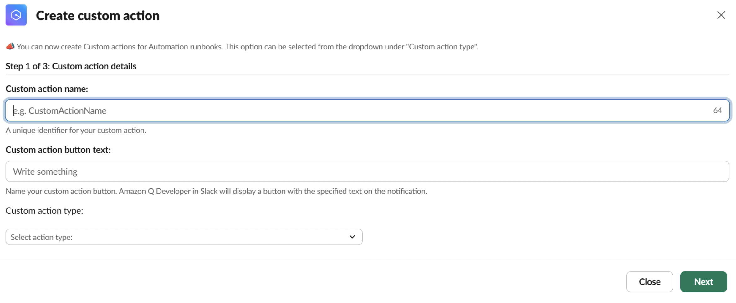
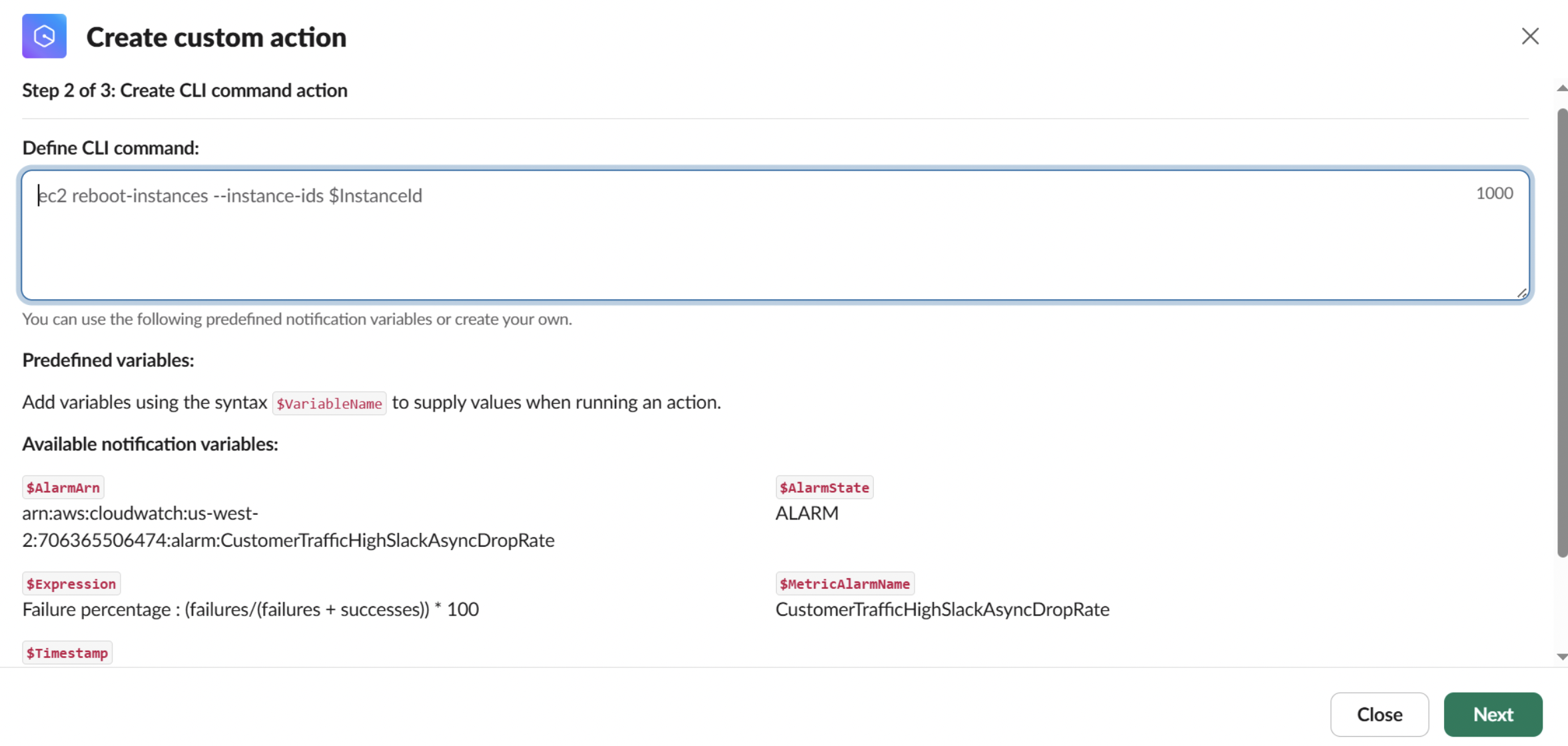
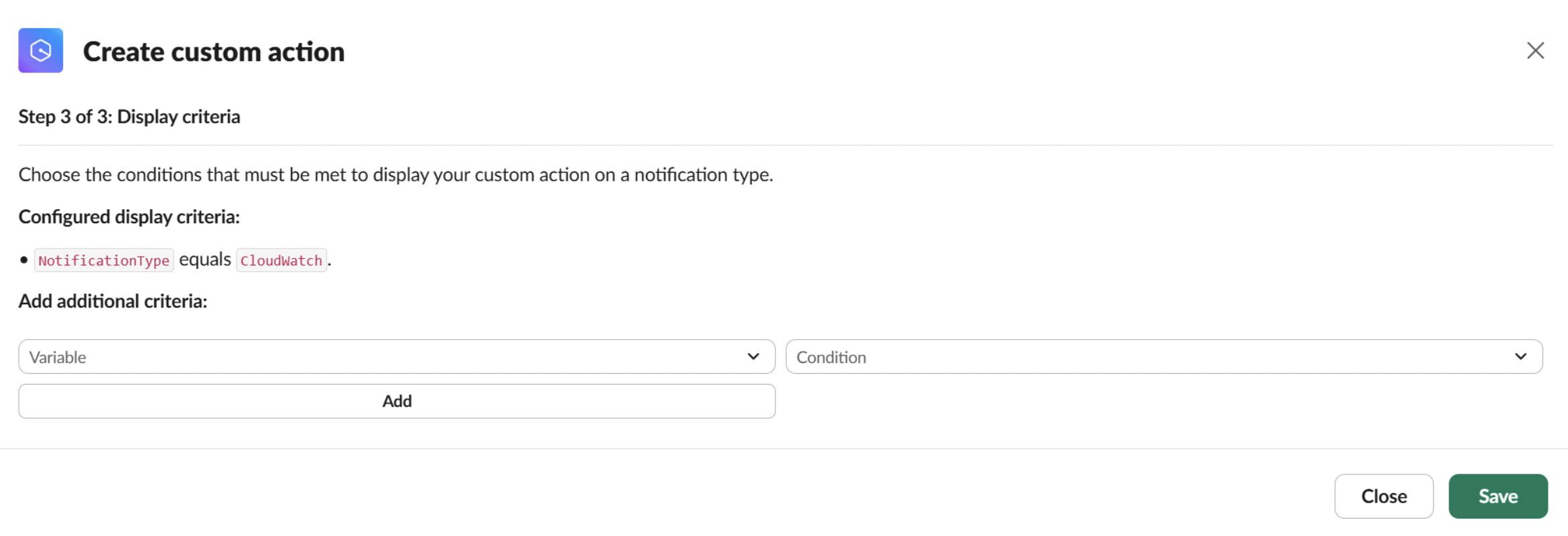
Slack: custom actions flow — the following images show the text written and the flow users experience when creating custom actions with Q in chat apps in Slack.
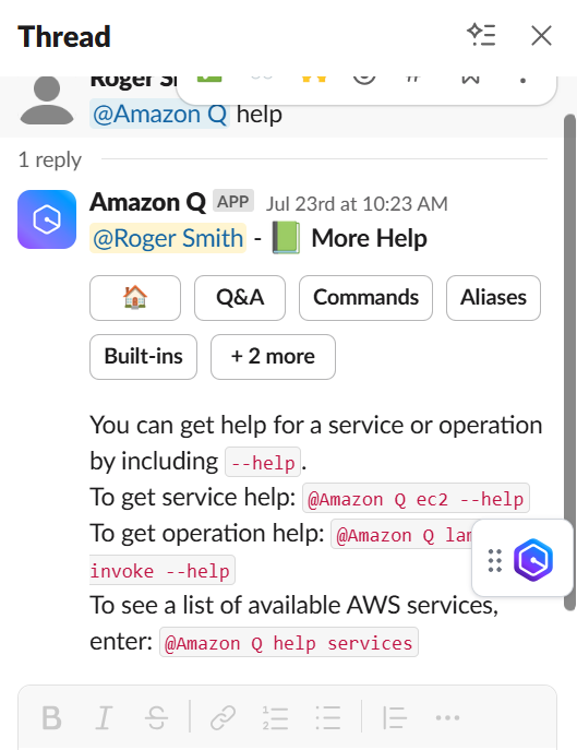
Progressive disclosure — this shows the progressive disclosure menu designed to improve the user’s experience. I designed the information architecture of the menu, wrote the text, and chose the emoji mappings.
Full case study: AWS Console Mobile App
+Overview. The AWS Console Mobile Application lets people view and manage a select set of AWS resources and receive push notifications, so they can stay connected to their AWS environment while away from a desk.
My role. Content designer, technical writer, and UX writer on the app, working alongside a PM, UX designer, engineers, and an editor, writing for the small, easy-to-overlook moments (empty states, modal interactions) that shape whether a mobile experience actually feels usable on the go.
Full technical documentation is live at docs.aws.amazon.com/consolemobileapp.
Documentation samples.
Each entry is a short note in my own words on what the piece is and what I did, with a link out to the live documentation itself. The content spans user guides, API guides, and AWS CloudFormation entries. Click an entry to expand it. For UX writing and microcopy specifically, the richest example is the permissions model in Case 05, Amazon Q in Chat Applications.
Amazon Q Developer in chat applications
+View live doc →
AWS Console Mobile Application
+View live doc →
AWS User Notifications
+View live doc →
AWS Management Console
+View live doc →
AWS User Notifications — CloudFormation Guide Entry
+View live doc →
Amazon Q in Chat Applications — CloudFormation Guide Entry
+View live doc →
Academic and independent research, in the same spec-card form.
Team studies and published work, separate from the AWS product case studies above. Same pattern: flip for the details, full write-ups below the grid.
Researching trust, safety, and convenience in local resale.
A team UX research project on buying and selling used items locally, spanning competitive analysis and interviews through personas and design concepts.
Helping managers see who's on shift, and who can help.
Industry-partner research with Home Depot on associate task management: observation, interviews, and a prototype built around visibility and skill-matching.
A published study on representation and its real effects.
Mixed-methods research with Dr. Adrienne Decker on how QPOC representation in video games affects QPOC players, using a survey plus one-on-one interviews.
Researching whether a federal agency's IT investments were actually governed.
A GAO report to Congressional committees examining HUD's IT governance and recommending additional oversight actions.
Profiling 16 of the federal government's highest-stakes IT programs.
A GAO report examining the cost, schedule, and risk of 16 mission-critical federal IT acquisitions, part of an area GAO has flagged as high-risk since 2015.
Redesigning a real-time physics tool to feel new, but familiar.
A Brookhaven National Laboratory internship project redesigning the real-time display for polarized jet data, balancing users' request for something new against their reliance on the old tool.
Survey and playtest data behind a music-driven puzzle-platformer.
Data analysis and survey design for Gloom Box, an RIT capstone game, including data gathered from professional developers at GDC.
Evaluating gameplay and UX across three mobile titles.
QA and UX evaluation for the CN Arcade app and its titles across iOS, Amazon, and Android, partnering with producers and developers to refine mechanics and interface design.
Benchmarking graphics libraries for a physics control room.
Evaluated the performance, look, and feel of Python and Java plotting libraries for BNL's Collider-Accelerator Department, including a direct Python-vs-Java throughput comparison.
Full case study: Local Marketplace Research
+Overview. A team project aimed at improving the experience of buying and selling used items locally in metro areas, for users 18–35. Early research surfaced convenience, safety, and trust in item integrity as the core pain points, which shaped everything that followed. Team: Nia Lindsey, Anna Malecki, Whitney Nelson, Andy Zhou, and myself.
My role. Research phase: synthesized competitive analysis findings, contributed survey questions, and ran two semi-structured interviews. Analysis phase: helped build affinity diagrams and generate design criteria. Design phase: joined brainstorming sessions, made mock-ups and storyboards for one design alternative, and helped build the prototype in Sketch with InVision for interactivity. Evaluation phase: helped write the evaluation plan and tasks, and recruited participants.
Research methods. A competitive analysis mapped existing solutions against the pain points we were seeing. Semi-structured interviews with 5 participants (convenience sampling) surfaced three recurring themes: convenience, safety, and anonymity. A follow-up survey (68 responses, distributed across Reddit, Facebook, iMessage, GroupMe, and Tumblr via snowball and convenience sampling) found most respondents were 18–34 and metro/suburban, largely neutral on anonymity, generally comfortable meeting a buyer or seller, and split between shipping and meeting locally as the most convenient exchange method.

Survey results across three of the questions asked.
Synthesis. Qualitative coding of the survey's open responses confirmed convenience, safety, and trust as the major themes, which drove the interview question design. Task analyses for both buyers and sellers, plus personas built from the research, gave the team a shared model of user needs going into design. An affinity map of the interview data, built by "walking the wall," turned high-level pain points into concrete design ideas, both granular features and larger concepts.

The affinity map, built by walking the wall.

Task analysis for both the buyer and seller sides.

Personas built from the research: Janice Powell and Jackson Mitchell.

Design criteria, prioritized against user goals.
Design directions. The team narrowed dozens of sketched ideas down to three concepts for further development: a meet-up helper, a gamification approach, and a locker-agent concept for exchanging items without meeting in person.

Ideas grouped under the three major themes.

The same theme tree, in detail.

Further ideation, branching into specific feature concepts.

Early low-fidelity wireframes for the app.

The seller and buyer app flows, screen by screen.

Narrowing the brainstorm down to the three final directions.
Full case study: Home Depot Tasking App
+Overview. An industry-partner project with Home Depot on associate task management, helping the company balance customer engagement against internal store needs. The team narrowed scope to managers and supervisors, who needed a better way to track associates' schedules and skills and to quantify customer engagement. Team: Anna Malecki, Whitney Nelson, Andy Zhou, and myself.
My role. Research phase: conducted 3 of 7 associate interviews, ran observation sessions, contributed to secondary research. Analysis phase: contributed to qualitative coding, built the task analysis for both associates and supervisors, helped identify design implications. Design phase: joined brainstorming and empathy-mapping sessions, generated multiple rounds of sketches and wireframes. Evaluation phase: helped write the heuristic evaluation plan, recruited participants, helped analyze results, and acted as note-taker/facilitator during other evaluation sessions.
Research methods. The team started with secondary research: Home Depot job descriptions, associate forum discussions (Green Door, Reddit), competing tasking apps, and company news, before observing three different store locations to understand spatial layout and how associates actually used their tools. Key finding: the stores' large floorspace made it hard for one associate to find another, and shared work phones (FirstPhone) meant devices were often passed between associates mid-shift. Semi-structured interviews followed, with 4 associates and 3 managers/supervisors, analyzed through qualitative coding.

Observation notes from an in-store visit.

Affinity grouping from the qualitative coding pass.
Constraints. The two biggest challenges were access, since managers and supervisors run busy, inflexible schedules that made scheduling research time difficult, and technology, since associates share a limited pool of FirstPhones (often without signing out) and aren't permitted personal phones on the floor. Both constraints shaped the design space directly.

Design implications, mapped from user attributes to concrete design requirements.
Synthesis and ideation. Personas, empathy maps, and storyboards captured user needs and pain points. From brainstorming, the team sketched three directions: a FirstPhone app to check who's on duty, a customer-feedback kiosk that also surfaced associates' assigned tasks, and a digitized version of Home Depot's existing peer-to-peer feedback system (Bravo Board). User feedback sessions favored the first idea, developed further with elements of the third.

Personas: Tina, a sales associate, and Gary, an assistant manager.

Empathy maps for the assistant manager and hourly associate roles.

Storyboards illustrating pain points around customer help and cross-department requests.

Brainstorming pain points into early concept ideas.

Evaluating the three initial concepts against user feedback.
Final concept. An app centered on visibility and skill-matching: browsing who's on duty, filtering by skill or knowledge, and sending posts to ask for help or collaboration, addressing the core problem that associates and managers couldn't easily tell who was working or find them in a large store.

Early hand-drawn sketches of the app's core screens.

The digital prototype: sign-in, associate directory with filters, and posting a request.
Evaluation. Moderated usability testing with 6 Home Depot managers and associates (think-aloud, quantitative + qualitative post-task questions) ran alongside unmoderated heuristic testing with 3 UX professionals against Nielsen Norman's heuristics. Findings drove concrete iterations: an onboarding flow after users missed the filters and status indicators, a redesigned add button after participants weren't sure what it did, and a restructured posting flow after users confused "posting" with "emailing."

Usability issues surfaced across the three test tasks.

The onboarding flow added after testing, walking new users through filters and status.

The add button, redesigned to be more explicit about its function.

The posting flow, restructured to stop users confusing it with email.
Full case study: QPOC Representation in Video Games
+Overview. Part one of a study, carried out with Dr. Adrienne Decker, exploring the real effects of representation in video games as a medium, and investigating design methods for well-rounded, impactful representation of Queer People of Color (QPOC). The published paper has since been cited 14 times in scholarly literature. Read it here.
My roles. Experimental designer, researcher, data analyst, writer, interviewer, and survey designer.
Methodology. A mixed-methods study using a convergent design approach: an online survey and a set of one-on-one interviews, run in parallel and brought together during analysis. This first paper focuses on the survey component.
Survey design. The QPOC Representation in Video Games Survey collected demographic data: age, sex, gender, sexual orientation, and race/ethnicity (using the US Census Bureau's race/ethnicity questions for consistency with established measurement standards). Respondents then answered 5-point Likert-scale questions on their agreement with statements about QPOC representation and identity in games, followed by two open-ended questions on identity and representation.

The full research poster: demographics, Likert-scale results, methodology, and conclusions.
Full case study: GAO — HUD IT Governance
+Overview. Information Technology: HUD Can Take Additional Actions to Improve Its Governance (GAO-15-56), a report to Congressional committees published by the U.S. Government Accountability Office in December 2014, examined how well the Department of Housing and Urban Development governed its IT investments and recommended additional oversight actions. Read the report here.
My role. Researcher and data analyst on the engagement, contributing to the analysis behind a report delivered directly to Congressional committees, a different register of stakes and audience than product or academic work, where findings inform federal oversight decisions rather than a product roadmap.
Full case study: GAO — Critical IT Acquisitions
+Overview. Information Technology: Key Attributes of Essential Federal Mission-Critical Acquisitions (GAO-20-249SP), published by GAO in September 2020, profiled 16 IT acquisitions the federal government identified as critical to missions ranging from national security to public health to the economy — describing risks to their cost and schedule. IT acquisitions and operations management has been on GAO's High-Risk List since 2015. Read the report here.
My role. Researcher and data analyst, contributing to the analysis behind profiles of some of the federal government's highest-stakes, highest-cost IT programs, the kind of work where a wrong or unclear finding has consequences for agencies spending billions of dollars over more than a decade.
Full case study: Brookhaven Polarized Jet Data Display
+Overview. An internship project at Brookhaven National Laboratory redesigning the application used to display polarized jet data in real time. The redesign's constraints came directly from its predecessor and from the users themselves: the interface had to feel new, but still familiar to people who relied on the original tool daily.
My role. Programmer, designer, and usability researcher, carrying the project from understanding what the original Tcl/Tk application got right and wrong, through redesigning the interface, to building the replacement in the same language so it would integrate cleanly with the lab's existing systems.
The constraint. "New, but familiar" is a harder brief than either half alone: a pure redesign risks alienating users who've built muscle memory around the original, while a too-faithful update risks not solving the problems that prompted the redesign in the first place. Balancing those two pulls shaped every interface decision.

Before: the original application.

After: the redesigned application, shown in motion.
The technical problem. The original tool only allowed one running instance, displayed information nobody used, and had no way to control the underlying process remotely. The fix split the program into a server process (cycling state, feeding the data acquisition system, exposing parameters through an editing tool) and a GUI that could talk to that server, letting multiple people interface with it and see each other's changes reflected live.

The core issues with the original tool, and the split-process solution.

The redesigned controller, mid-acquisition with real data.

The same window, scaled wider to show more of the polarization log at once.
Beyond the one tool. The same conversion work extended to related programs used alongside the jet controller, including a scanner application for determining relationships between beam variables, converted from Tcl/Tk to Python using the same approach.

The Scanner Application, converted using the same approach.
Full case study: Gloom Box Playtest Data
+Overview. Gloom Box is a 2D music-driven puzzle-platformer built as an RIT Game Design & Development Master's capstone project in Unity2D and C#, developed under the team name Pentatonic Games. Read more about the game here.
My role. Data analyst, user researcher, and survey writer, responsible for the surveys and playtest data used to iterate on the game, including sessions with professional developers at the Game Developers Conference (GDC).
The data. Playtesting ran across eight rounds from February through December 2017, tracking how the game's mechanics and feel evolved release over release. All playtest data is public for anyone who wants to see the raw results behind the design decisions.
Full case study: Cartoon Network CN Arcade QA
+Overview. As a Digital Media Intern at Cartoon Network, I evaluated gameplay experience and UX for the CN Arcade app and its mobile titles, including Steven Universe: Shattered Dreams, Teeny Titans 2, and Smashy Piñata, across iOS, Amazon, and Android.
My role. QA and UX evaluation across platforms, partnering directly with game producers, creative directors, and developers to refine mechanics and interface design, with the goal of improving user satisfaction and interactive quality on every platform the titles shipped on.
Media. Testing across devices was part of the job — checking how the same session held up on a tablet versus a phone, since resource counts, UI scaling, and progress state all had to stay consistent across screen sizes.

Testing the same session across tablet and phone.
Full case study: Brookhaven Data Visualization
+Overview. A GEM Fellowship project at Brookhaven National Laboratory's Collider-Accelerator Department, evaluating the performance, look, and feel of graphics libraries used for control-room data visualization, and building out plotting tools in the languages best suited to replace an aging Java-based system.
My role. Programmer, working directly under the department's existing tooling (JChart, a Java-based logging and plotting application already in use for monitoring accelerator systems) to evaluate whether Python's plotting ecosystem could match or beat it.

JChart, the existing tool the evaluation was measured against.
The comparison. Rather than argue for Python on principle, I benchmarked it directly against Java on the same task: plotting the same volume of data over the same elapsed time. Python's Matplotlib handled roughly 685,000 points in the time Java managed about 52,000, a real, measured throughput difference rather than an assumed one.

Python versus Java, plotting throughput over the same elapsed time.
Beyond the benchmark. The fellowship also covered adjacent tooling work: GpmLoggerInfo (restart handling, tree depth, time sorting for the department's logger management interface) and DataScrape.py, a shell-scripted, cron-scheduled scraping tool.

Additional tooling work from the same fellowship.
Built on my own initiative.
Self-directed tools, designed, built, and shipped without a client or employer behind it, mostly using Claude Code. Flip a card for the stats, expand below for the full story.
A client-side audit tool for Answer Engine Optimization.
A browser-based tool that scores web content against a published 100-point AEO rubric, built solo with Claude Code as designer, developer, and content strategist.
A CLI tool that audits UI copy before it reaches production.
Scans a React frontend for unhelpful error messages, missing accessibility attributes, click-phrased buttons, and tone violations against a project's own style guide, before a change ships.
A CLI tool that generates API docs from git diffs.
Parses two git commits, finds every Express route that changed, and generates Markdown documentation grouped by what actually needs a reviewer's attention.
A Claude Skill, and a product concept for what it could become.
A portable Skill that audits UI copy against any active style guide, paired with a UI concept that marks up a draft like an editor with a red pen instead of a generic results dashboard.
Full case study: AEO Scanner
+Overview. A browser-based tool that audits web content against a published 100-point rubric for Answer Engine Optimization (structuring content so AI systems like ChatGPT and Perplexity can find, extract, and cite it). Designer, developer, and content strategist on this one, built solo with Claude Code. It grew out of the same instinct behind the AWS User Notifications work: find the one framing sentence or structural decision that makes something complex legible.
The problem. Most AEO tools I found measured structure alone (schema present, headings tidy) and called that optimization. The rubric I built against draws a real line between checks a script can verify and checks that need human judgment. I wanted a tool that respected that line instead of collapsing it into one misleading number.
Design decisions. Client-side only, by choice: everything runs in the browser, no backend, no dependencies beyond two web fonts. A request to check a live URL directly ran into a real constraint (browser CORS policy blocks that kind of cross-origin fetch), and rather than bolt on a fragile proxy workaround, I reduced the actual friction instead, surfacing clear "View Page Source" instructions the moment someone switches into HTML mode. The score is out of a real 100, with judgment-only checks marked "pending review" rather than scaled into a smaller, more confusing ceiling. Markdown input is supported too, converted into minimal HTML and run through the same scoring functions as full HTML, so there's only one scoring implementation to keep correct.
A category split, found through testing. While auditing my own tool against the source rubric, I found two checks I'd built as simple keyword-matching that the rubric actually classifies as judgment calls, and one I'd filed under judgment that the rubric treats as mechanical (it just needs a full-site crawl to verify, which is a data limitation, not a judgment one). Conflating those was dishonest about what the tool could actually tell someone. I split them into two labeled categories, "needs review" and "needs more data," and kept the original keyword heuristics visible as disclosed, unscored hints rather than deleting them or leaving them silently mis-scored.
A real debugging story. Testing a "clean" sample surfaced five distinct bugs: a judgment-only check with a hardcoded pass that silently scored every scan; a text-extraction method that broke because it depended on the browser having rendered the element, which a parsed-but-unattached document never does; a paragraph-length check that was counting headings as paragraphs; a hedging-language regex that flagged "it does not depend on X" as vague because it matched "it does" without checking for the negation that followed; and a scoring ratio that counted inapplicable checks in its denominator, so content that maxed out everything it could actually be scored on still failed. Each bug was caught with a real DOM-testing environment and confirmed fixed by re-running the same test.
Testing it against an LLM-written sample. I ran AI-generated content that had graded itself a 52/100 through the tool; it scored 16/100. Most of the gap was legitimate: the sample was a bare content fragment missing the page-level metadata a full document needs. The more interesting finding was what the self-graded 52 likely reflected: an evaluator scoring its own substance and originality, the single most subjective, highest-weighted section of the rubric. My tool refuses to auto-score that section at all, for anyone or anything doing the judging.
What I'd build next. Broader schema-format detection beyond JSON-LD, and crediting well-formed table rows and list items as citable facts alongside prose paragraphs. Both are real gaps I left out of v1 on purpose.
Full case study: ui-copy-guard
+Overview. ui-copy-guard scans a React frontend for UI copy problems and generates a full audit report before a change ships: unhelpful error messages, missing accessibility attributes, click-phrased button text, and tone or jargon violations judged against the project's own style guide. It runs from the terminal against a target directory and writes a Markdown report to disk. Designer, developer, and content strategist, built solo with Claude Code.
The problem. Content standards for UI copy usually live in a document nobody checks against in the moment. A developer ships an error message that just says "Error occurred," or an icon-only button with no aria-label, and it isn't caught until a design or accessibility review much later, if at all. I wanted a tool that closes that gap: something a developer or writer runs before a change goes out, not after.
How it works. Three parts, each doing one job. A scanner crawls a directory for React files and extracts UI copy (button text, link text, image alt attributes, headings) using regex rather than a full JavaScript parser, a deliberate tradeoff: simpler to read and modify, and sufficient for the common case of a flat string inside a tag. A report generator sends that extracted copy, along with the project's own style guide, to Claude with instructions to evaluate it as a senior UX writer and accessibility expert would. A CLI layer ties the two together and writes the result to UX_AUDIT_REPORT.md.
A real debugging story. Testing the scanner against a component with <button onClick={() => {}}> surfaced a genuine bug: the > inside the arrow function closed the regex's match for the opening tag early, corrupting everything captured after it. The button's real content, an icon with no text, got reported as garbled JSX syntax instead. The fix wasn't a full AST parser, which would have defeated the point of choosing regex in the first place. Instead, the scanner now detects when an extraction looks corrupted (leftover =>, {, or } in the captured text) and flags it with an explicit warning rather than silently treating broken syntax as real copy. The report generator is instructed to skip flagged extractions unless the visible portion is still clearly a violation. Catching that failure mode and deciding how to handle it honestly, rather than hiding it, is the actual engineering work here.
A real dependency decision. Partway through, chalk (used for colored terminal output) turned out to have gone ESM-only as of version 6, which conflicts with the rest of the project's CommonJS style. Rather than restructure the whole project around ESM for one dependency, I pinned to chalk@4, the last CommonJS-compatible major version and still in wide production use for exactly this reason.
Why the AI layer matters. The mechanical checks (missing alt text, banned error phrases, click-phrased buttons) don't need a model; they're deterministic. The tone and jargon check is different. Deciding whether "payload failed to instantiate" reads as jargon in a customer-facing string depends on context a keyword list can't reliably capture. That check is genuinely delegated to Claude, sent alongside the actual style guide rather than a hardcoded list of banned words, so the standard itself stays the source of truth.

Running the tool against a demo app: scan, send to Claude for review, write the report.
Sample output. A real audit run against a two-file demo app, unedited:
Line 9 · <button> with no visible text — needs an aria-label describing its function.
Line 12 · link text "Click here to go to dashboard" — suggested: "Go to dashboard"
Line 8 · alt="image" — non-descriptive placeholder; suggested: describe what the image shows.
Line 17 · button text "Click here to save" — suggested: "Save changes"
What I'd build next. Vue and Svelte template support, a batching strategy for very large codebases (currently one API call covers the whole scanned directory), and a --fix mode that applies safe, mechanical corrections automatically.
Full case study: docgen
+Overview. docgen is a command-line tool that generates Markdown API documentation from the diff between two git commits. Point it at a repository, a file, and two commit references, and it parses both versions of the file, finds every Express-style route that changed, and produces a documentation update grouped by what actually needs a reviewer's attention: new endpoints first, then changed endpoints with a plain-language summary, then a flagged warning for anything that disappeared. Designer, developer, and content strategist, built solo with Claude Code.
The problem. Documentation drift happens because nothing forces a code change and a documentation change to move together. A developer adds a parameter to an endpoint, ships it, and the docs quietly fall out of date until a user hits the gap. I wanted to test whether that connection could be automated: read the actual structural diff between two versions of a file, not a guess at what changed, and generate documentation from that.
How it works. The tool parses both versions of a file with a real JavaScript AST parser, not regex pattern-matching. It walks the parsed structure looking for Express router calls (router.get, router.post, and so on), extracting each route's JSDoc comment and the parameters its handler actually destructures from the request object. Once both versions are parsed into structured route data, a diff function compares them by method and path, classifying each as added, changed, removed, or unchanged. A Markdown generator turns that diff into a document a reviewer can act on directly.
Testing with real git history. Rather than testing against mocked data, I built a small demo API with three genuine git commits: an initial version, a version that adds an endpoint and two new parameters, and a version that removes an endpoint entirely. Running the tool against real commit hashes pulled directly from git history, not just two files sitting on disk, meant the diff detection had to work the way it actually would in a real repository.
Verifying all four states. Before calling the tool done, I tested it against four distinct scenarios: a version with one new endpoint and two changed ones, a version compared against itself to confirm zero false positives, a version with an endpoint deliberately removed, and confirmation that removed endpoints are flagged with an explicit warning rather than silently dropped from the documentation. All four produced correct, expected output on the first pass, a good sign the AST-based approach and real git history were the right way to test it, not just the convenient way.
What I'd build next. Support for additional route-definition patterns beyond Express (Fastify, Koa), and wiring in the Claude API to draft a plain-language description for routes that have no JSDoc comment at all, using the function body as context. That would move the tool from structuring documentation that already exists to drafting documentation from scratch when none does.
Full case study: Microcopy & Tone Audit
+Overview. Two connected pieces. The first is a real, functional Claude Skill: a portable set of instructions that lets Claude audit UI copy against a style guide, flagging tone violations, unhelpful error messages, click-phrased buttons, and accessibility gaps, then suggesting specific rewrites. The second is a UI design concept for what a dedicated product built around that skill could look like. Designer, prompt architect, and content strategist, built solo with Claude Code.
The problem. I'd already built ui-copy-guard, a CLI tool that runs the same kind of audit against a codebase. A Skill is a different artifact: portable, usable directly in conversation, installable by anyone with a Claude account, no terminal required. I wanted to test whether the same judgment I'd encoded into a script could work just as well as a set of instructions for Claude to follow directly, and whether that judgment could genuinely adapt to a user's own style guide rather than applying one fixed standard regardless of input.
Building and testing the skill. The skill's most important behavior is that it uses whatever style guide is active. I tested this directly with two audits of similar copy: one against a strict, professional default guide, and one against a custom guide describing a playful, casual brand voice with explicit rules ("never say error," "buttons don't need a verb if the meaning is obvious"). The same button text, "Got it," was flagged under the strict guide and correctly passed under the casual one. That confirmed the skill was reading and applying the active guide's actual rules, not falling back to a fixed internal list regardless of what it was given.
Designing the product concept. I started with a template dashboard: two panels, a results list, a row of cards. It worked, but it looked like every other AI tool interface, and reflected back on it, the layout wasn't doing anything to communicate what the tool was actually for. I rebuilt it around a different question: what does a person who edits copy for a living actually work with? Not a dashboard. A marked-up page. The redesign puts the draft text on the page and marks it up directly: real strikethrough through the phrase that should go, a highlighted flag on what stays, with handwritten-style notes in the margin explaining each mark, the way an editor would annotate a manuscript with a red pen. The visual language, a serif body face for the manuscript text, a typewriter mono for labels, an editorial red as the single accent color, comes directly from that world rather than a generic tech palette.
Verifying the redesign actually worked. Rather than assume the new layout would render the way I intended, I used Playwright to load the file in a real browser and take screenshots of both states, empty and after running an audit. That caught something real: my sandbox's network restrictions blocked the custom fonts from loading, so my own screenshots showed system font fallbacks instead of the intended typefaces. That's a limitation of my own testing environment, not a bug in the file, but I would not have known that distinction without actually rendering it and looking, rather than trusting the code by inspection alone.
What this is and isn't. The SKILL.md file is the real, working piece; it was tested with actual inputs and produced correct, adapted output both times. The visual demo below is a design artifact showing an intended product experience, built with placeholder results triggered by a click, not a live connection to the skill or the API. Being clear about that distinction matters more than making the demo look finished.
What I'd build next. Wiring the demo's "Run Audit" button to a real API call so the marked-up output reflects genuine analysis of whatever the user pastes in, rather than a fixed example. And extending the margin-note pattern to handle multiple simultaneous issues in a single longer passage, not just one flagged phrase.
Games I've built.
Three projects spanning audio design, systems design, board game design, and playtesting-driven iteration. Click to flip; full write-ups are below.
A boombox, three genres of music, and a girl who can remix the world.
Muse explores a musical world with her sentient boombox, Gloom, using cassette tapes tied to music genres, each granting a different ability that can be mashed up with others.
Your life is your ammo. Every choice costs something.
A game about attack, befriend, or avoid, where each interaction with an enemy is a metaphor for how we handle people in real life.
A dance battle where staying close to your partner is the whole game.
A cooperative-competitive 4–8 player board game where teams of two coordinate dance moves and proximity to out-score the other pairs each round.
Full write-up: Gloom Box
+Overview. Gloom Box is a 2D musical puzzle-platformer following Muse as she explores a musical world called Opus, accompanied by her sentient boombox, Gloom. Gloom lets Muse play cassette tapes she finds; each tape holds a different genre of music, and each genre grants a different ability. Play the game · visit the dev blog · third place, RPI's 2017 Game Fest.

The title screen.
My roles. Lead audio designer, game designer, user researcher, and programmer.
Game mechanics. Three core abilities, each tied to a genre: choral makes NPCs bouncy, heavy metal makes monsters heavier and weighs down objects like buttons, and blues makes NPCs cry, producing water. Abilities can be mashed up two at a time: heavy metal plus choral, for example, reverses gravity. Two-ability mashups turned out to be the right ceiling for the number of interactions the game needed without becoming unreadable.

Muse choosing between abilities mid-level.
User research. Research ran as bi-weekly playtests using talk-aloud, direct observation, retrospective testing, semi-structured interviews, and surveys, with findings feeding directly back into design. See the full research data here.
A change driven by playtesting. Early on, players struggled to track which ability was active. The fix was color-coding: each genre got a color (blues = blue, heavy metal = red), and a mashup's area-of-effect showed as a blend of both: a heavy metal/blues mashup renders as purple. Beyond clarifying the mechanic, this made the game more accessible to players who are hearing impaired, since the ability system no longer depended on audio cues alone.

The purple AOE circle: a Blues + Heavy Metal mashup in use, color reinforcing which abilities are active.
Complexity map. A full map of every interaction available in the game (three base abilities and their mashups) was used to keep the interaction space intentional as the design evolved, rather than letting mashup combinations grow unchecked.

The full complexity map: every ability, mashup, and interaction, kept intentional as the design grew.
Watch it played. A YouTuber's playthrough of Gloom Box:
Full write-up: Pixalto
+Overview. Pixalto is a game built around choice: your life is your ammo, so every shot you fire is life you no longer have. That trade-off is the entire tension of the game: more aggression means more power in the moment, and less room for error afterward.
My roles. Lead audio designer, game designer, user researcher, and programmer, the same mix of roles as on Gloom Box.
Mechanics. Facing an enemy, the player has three options: attack (spending life as ammo), befriend a friendly enemy (rewarded with more ammo/life, and the enemy takes on the player's hue), or avoid the encounter entirely. Critically, there's no visual distinction between hostile and neutral enemies, so the player has to decide how to engage without knowing in advance whether it'll pay off.

The befriend prompt in action: the purple enemy has taken on the player's hue after befriending.
The metaphor. These three choices were designed as a metaphor for how we handle people in real life: we can attack, which sometimes takes a personal toll but is sometimes the necessary and valid choice; we can befriend and become a little more like the people we let close, carrying them with us; or we can avoid the interaction altogether. The game doesn't privilege one choice as correct; life is about balancing all three.
User research. Playtests ran at the end of sprints or after implementing a new feature, using the talk-aloud principle and retrospective testing to catch how players were actually reasoning through the attack/befriend/avoid choice, rather than how the design assumed they would.
Trailer.
Full write-up: Two To Tango
+Overview. Two To Tango is a cooperative-competitive board game for 4–8 players, played in teams of two. Each round, partners score by staying physically close to one another and coordinating their dance moves: cooperation within the team, competition between teams. See the listing on The Game Crafter.
My roles. Game designer and user researcher.
User research. The game was playtested weekly. Designers observed players directly and noted pain points or mechanics that needed adjustment, and ran semi-structured interviews whenever a specific mechanic was under test. Players were also free to share how the game made them feel, not just what confused them. See the changes made as a result of playtesting.

The full prototype setup: four player boards, dance move cards, and the central board.

The central board, tracking proximity and scoring for each team.

A single player board, folded up and ready to play.
Music and sound design.
Original compositions and sound design across games and other projects. Drag a tape into the deck, or just tap one.
Visual work.
Generative art and client poster design, outside the product and research work, made just to see what a medium could feel like.
Cellular automata, tuned to feel like the northern lights.
A generative visual and audio piece meant to mesmerize the viewer into a state of both attention and relaxation.
Poster concepts for a New York fashion label.
Visual design poster concepts for New York based fashion designer OMONDI, built in Adobe Illustrator.
Full write-up: Aurora Borealis
+Overview. Aurora Borealis is a meditative artistic piece built with cellular automata in JavaScript. The color scheme and backdrop take their cues directly from the northern lights, and the piece is designed to pull the viewer into a state that's both attentive and relaxed at once.
My roles. Designer, programmer, composer, and sound designer: every layer of the piece, visual and audio, built by one person so the two could be tuned against each other.
The experience. The visualized history of the automata creates flashing, shifting light patterns, which sit in deliberate contrast against a hazy, ambient audio layer. That tension between the flicker of the visuals and the calm of the sound is what gives the piece its particular feeling: not purely calming, not purely stimulating.

The piece in motion.
Full write-up: OMONDI
+Overview. Visual design poster concepts created for OMONDI, a New York-based fashion designer, built in Adobe Illustrator.


Three poster concepts for the OMONDI brand.
Logged, not yet loaded.
Two more entries are documented but not built out on this pass — wire these up the same way once you're ready to feature them.
Shoot your shot.
Applications are a lot to keep track of. Clear the real offers before time runs out, but watch for recruiter spam, and don't click it.
The hiring process is broken. Let's refactor it.
Usually, I apply to you. But I'm a UX writer, and bad user journeys cause me physical pain. To optimize our conversion rate, I've streamlined this process. Welcome to my Reverse Job Application.
What I'm Looking For
I am seeking an employer who fits the following criteria:
- Tone of Voice: Transparent, empathetic, and capable of using punctuation correctly in Slack.
- Accessibility: Believes Content Design belongs in Figma during discovery, not as a "polishing phase" five minutes before a sprint ends.
- Tech Stack: A codebase with actual documentation, and an internal messaging system that survives without 47 daily
@heretags. - Localization: Must understand that "make it shorter" is a design challenge, not a magic trick.
Apply to Hire Me
Change my mind about corporate hiring. Drop your details below:
Write or draw something.
A little corkboard, just for fun. Pin a note and type, or sketch something instead — it's yours alone, nothing here gets saved or sent anywhere. Refresh the page and it's gone.
Writer. Designer. Researcher. Composer. Storyteller.
Hello, I'm Roger Smith II. I'm a content designer with a passion for storytelling, music, and design across multiple mediums. Most recently, I supported the UXP2 team at AWS as a technical and UX writer. The services I created content for are Amazon Q Developer in chat applications (formerly AWS Chatbot), AWS User Notifications, the Management Console, and the AWS Console Mobile Application. I graduated from the Georgia Institute of Technology with a Master's degree in Human-Computer Interaction, supported as a GEM Fellow through the National GEM Consortium. I received my first graduate degree from the Rochester Institute of Technology in game design and development, and my undergraduate degree from Hampton University in computer information systems.
