Home Depot Tasking

My team and I worked with Home Depot as our industry partner to figure out how to help their associates with task management and efficiency. Associates at Home Depot had too many tasks and management wanted to devise a way to balance customer engagement and store needs. Given this broad scope of tasking, we decided to focus on Associates in managerial positions such as supervisors and managers. We found that they needed a better way to track Associates’ schedules, skills, and an easier way to quantify customer engagement.
My Team:
Anna Malecki, Whitney Nelson, Andy Zhou
My Role(s):
In the research phase, I conducted 3 of our 7 interviews with Associates. I also performed observation sessions and contributed to our secondary research.
In the analysis phase, I contributed to qualitative coding, created the task analysis for both the associates and supervisors, and helped identify the design implications.
In the design phase, I participated in our multiple brainstorming sessions and contributed to our empathy maps. I also generated multiple iterations of sketches, and wireframes for different design ideas.
In the evaluation phase, I helped create the heuristic evaluation plan, recruited for said plan, and helped analyze the resulting data. I also acted as a note taker and facilitator during other instances of evaluation during preliminary design evaluation.
Research Methods
We initially reviewed Home Depot’s website to analyze job descriptions. This was to give us an understanding of the basic responsibilities and needs of our users. These responsibilities include:
• Associate’s responsibilities involve helping the customers and tasking, such as keeping the bay clean and stocked.
• Manager’s responsibilities involve assigning tasks to each associate and evaluating associates’ performance.
In addition to this, we reviewed comments from our users group in forums such as Green Door and reddit. The purpose of which was to gain an understanding of how our users feel about their work and their working environment.
We also reviewed other resources to better understand our user group. These include existing tasking apps and reading about Home Depot’s current business goals and news.

We visited 3 different Home Depot stores to observe the spatial layout of the store, how our users work with the help of technical devices at a behavioral level, and gain a basic understanding the working environment of Home Depot. This helped us identify design implications and better empathize with our user.
Important findings:
• Home Depot has a vast floorspace, so it could be time-consuming for one associate to find another associate.
• Home Depot has an intense working environment.
• Associates and managers rely heavily on their work phone (FirstPhone). Sometimes several Associates need to share phones while working.
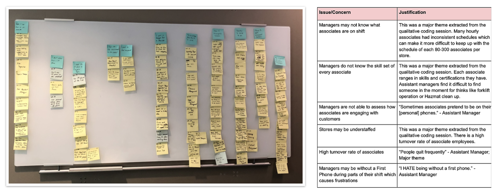
The goal our semi-structured interviews were to learn what in-store Associates and managers do and how they work, with a particular focus on how Associates and managers interact regarding tasking. We also aimed to explore user feelings and attitudes towards their work. We conducted semi-structured interviews in person with 4 Associates and 3 managers and supervisors. We analyzed this data utilizing qualitative coding to reveal recurring themes and issues.
Stakeholder Interview
We met with stakeholders to better understand the problem space, the policy of the company and needs of the business. We asked clarifying questions relating to constraints, value for the company, major factors, existing work, and level of access.
Task Analysis
We eventually constructed a task analysis represented this data through task analysis to ensure our system met all the needs of our users.
Synthesis of Findings
To better understand our user’s needs, attitudes, pain points, and goals, we created personas, empathy maps and storyboards to better illustrate who are users are.
Challenges
The primary challenge in this project was setting up face time with our users. We chose a very specific user group within Home Depot, managers and supervisors, and they run on a very busy schedule. These restrictions made it difficult to set up meetings with them because our sessions would be taking valuable time out of our user's work day.
Another challenge were the technological limitations of Home Depot. Home Depot Associate’s rely on a FirstPhone to access information and apps related to their jobs, however FirstPhone’s are limited in quantity and not every Associate has them. As a result of this, Associates often share FirstPhones without signing out. Associates are also not permitted to use their own personal phones while working on the main floor. Bearing these details in mind, we had to design around the limited quantity of FirstPhones, the sharing of phone accounts, and the lack of personal phone usage in the store.
These limitations forced us to be flexible in our design and research methodologies. We also learned how to maintain the balance between persistence (being assertive and asking supervisors for their time) and professionalism (being understanding of time limitations and limited availability). Though this meant we often did not get enough users to interview or test every time, we still managed to glean valuable insight from some users.


To aid in clarity pertaining to our design process, we created the above table to depict design implications as dictated by our user group.

We brainstormed and after consideration of feasibility and effectiveness, we chose 3 ideas to further develop as sketches.
1. An app on the First Phone for both associates and managers to check who is on duty.
2. A kiosk to allow customers to leave feedback and associates to check their assigned tasks.
3. A touchscreen on the wall implemented with digitized Bravo Board. (The existing peer to peer feedback system in Home Depot.)

Each design idea went through one function allocation and 3 rounds of sketch iteration before we settled on a final sketch. We then conducted user feedback interview sessions with our users to choose one of these 3 ideas.
As a result of these sessions, we were able to identify the perceived benefits and limitations of each idea from our users. Based on the user feedback we received, we chose to further develop idea 1 with elements of idea 3.

Our final concept is centered on Assistant Managers and Associates and their respective issues.
Both Assistant Managers and Associates have difficulty:
• Knowing who is on shift and their skillset.
• Finding a certain Associate in Home Depot store out of the large space
General Associates have difficulty:
• Asking for help from other associates when managers are not present.
At its core, this concept allows both managers and Associates to:
• Browse who is on duty.
• Use filters to find Associates/managers who have specific skills or knowledge.
• Send posts to Associates to ask for help or collaboration.
• Review and react to posts that are sent to them.


We conducted 2 different types of evaluative testing. These included moderated usability tests with 6 Home Depot Managers and Associates and unmoderated heuristic testing with 3 UX professionals.
In our moderated usability tests, asked participants to perform 3 critical tasks that represents our common user goals. Participants were encouraged to ‘think aloud’ throughout the session. We asked quantitative post-task questions about the difficulty and comfort of conducting each task and asked qualitative post-session questions about overall impression, missing features and frequency of use.
In our unmoderated heuristic test, we gave UX professionals the same tasks, but asked them to evaluate each task against Nielsen Norman’s 10 heuristic principles.
To analyze our usability data, we reviewed our notes and created a spreadsheet of issues each participant had for each task, along with quotes. We then quantified common issues. To analyze our heuristic test data, we used descriptive statistics. For the next steps, we would modify our prototype based on all of these results and go through further iterations of usability testings and design modification.

1. On-boarding Process
• 2 out of 6 participants didn’t notice the filters until prompted by the facilitator.’’’’
• Some Participants showed confusion about what add button does.
• Half of the participants lacked the initial understanding of status indicator without facilitator’s explanation.
Thus, we added an on-boarding process explaining the functionality of filter, status indicator circle and add button.
• The order of on-boarding screens indicates the workflow of the app.
• Users can click 'Got it!' button to skip the on-boarding process.
• They can also check these tutorials anytime by clicking the question mark icon.

• Participants showed confusion about what add button does
Thus, we redesigned the add button to make its functionality more explicit.

• Participants showed confusion the difference between posting and emailing.
Thus, we redesigned the process of writing a post to give users a better understanding of what each step does and better differentiate posting from emailing.
• Instructions are given at the top of the page.
• Adding location acts as a separate step.
• Different UI design is utilized when writing a post.


